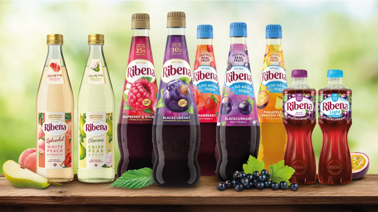
Iconic beverage label Ribena has recently introduced a new brand identity, developed with help from the renowned creative team at Elmwood. With the aim of maintaining the brand’s familiarity while enhancing its shelf appeal, the revamped identity features a bold new logo while retaining key elements of its heritage.
The updated visual identity for Ribena features a reimagined logo where the traditional blackcurrant-colored wordmark is replaced by a bolder red hue. The curvature in the old lettering has been transformed into a more streamlined and clean baseline. The alterations also extend to the letterforms, which have been molded to look more “plump and juicy”, further emphasizing the brand’s fruity image.
Charlotte Distefano, Elmwood’s Creative Director, explained that their mission was to strike a balance between ‘familiar difference’. They observed that despite customers’ love for Ribena’s taste, the brand was often overlooked on store shelves. Therefore, the goal was to create a design that was immediately recognisable as Ribena, whilst boosting brand visibility and establishing a consistent look and feel.
Key, heritage-linked elements, such as Ribena’s blackcurrants, have been retained in the rebranding, but are now subtly positioned in the background. A fresh “juicy droplet icon” has been introduced beneath the fruit, complemented by a vibrant purple backdrop and gold accents to further augment the brand’s aesthetic appeal.
Elmwood confirmed that in trials, the refreshed packaging showed significant improvements across measures such as purchase intent, recall, and perceived taste, while still being easily identifiable as Ribena. Ribena, a company established in 1938, is currently held by Suntory Beverage & Food GB&I.
What are the key changes in Ribena’s new logo?
The former blackcurrant-hued wordmark has been replaced by a bolder red logo and the curved old lettering has been simplified into a cleaner, straight baseline.
What was the goal of Ribena’s redesign?
The aim was to create an instantly recognisable yet distinctive design that enhanced the brand’s visibility and created a consistent look and feel.
How has the reaction been to the new packaging?
The new design performed well in trials, showing improvements in purchase intent, recall, and perceived taste, while maintaining its recognisability as Ribena.